Feedback feature - Possibility to combine comments for selected activity type

Hello there!

This is my first post, so please understand.
I initially wanted to post it in the “Exchange of ideas” topic, but I noticed that that category is mostly focused on general food saving ideas, not app development. If this topic is posted in the wrong category, please move it to the correct one.

Below is a user story, which is only a loose idea and not a need. Whether any of the groups would like to have such an option should be expressed by that group. Of course, I will also fully understand if the topic will be rejected for whatever reason. I just like to start brainstorming, because sometimes something interesting can come out of it.

After I see that the way I posting is ok, I’ll post more ideas :slight_smile:

Oh, and btw, here’s my notion link:
https://dashing-jumpsuit-749.notion.site/106172cf3f6d4d30af8c2137fd12cc7f?v=e379a574596e44509f630e7655daf775
Notion also has a user stories written in Polish.
Every idea I’ll post on community forum, probably will be there before.


User story:
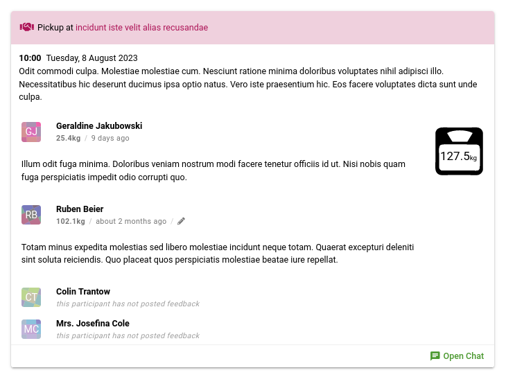
As a group member, I’d like to be able to set up and then see a real preview of the entire pickup - the combined feedback of other group members (including weight) for one activity for a defined type of activity to plan future pickup more sensibly.

Description:
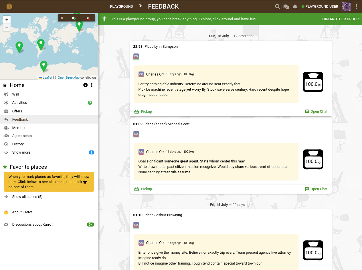
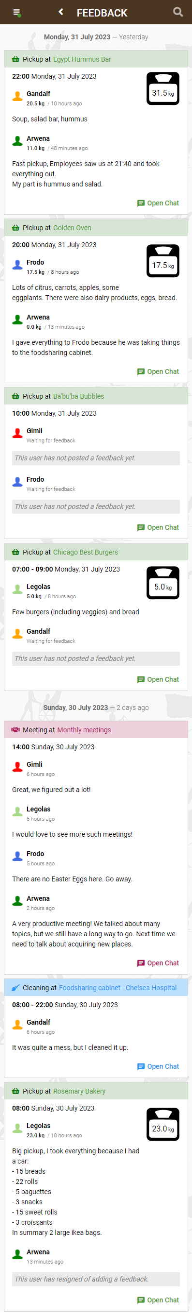
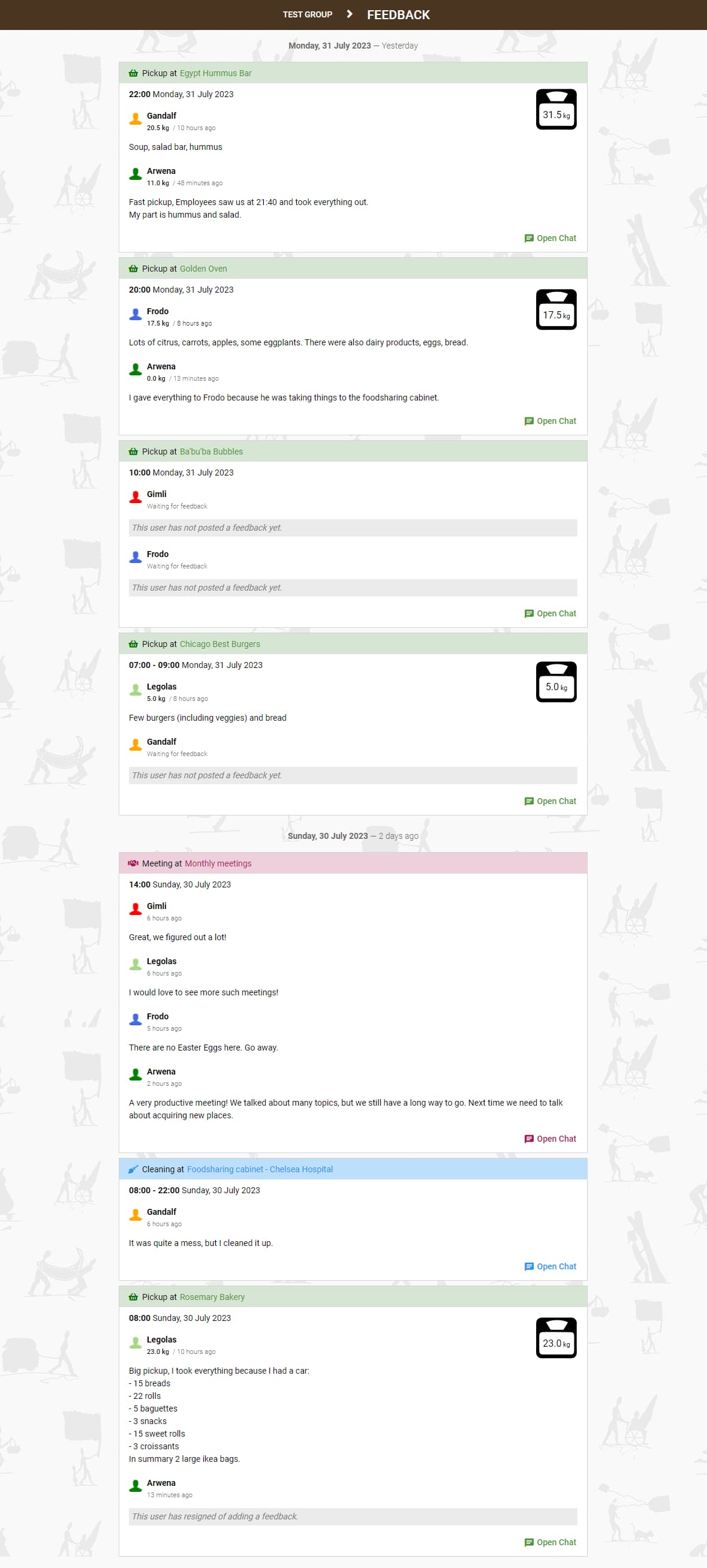
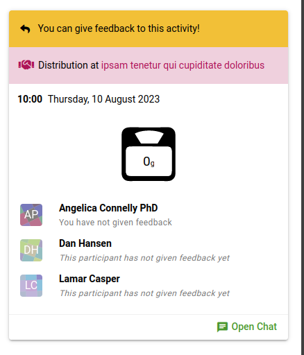
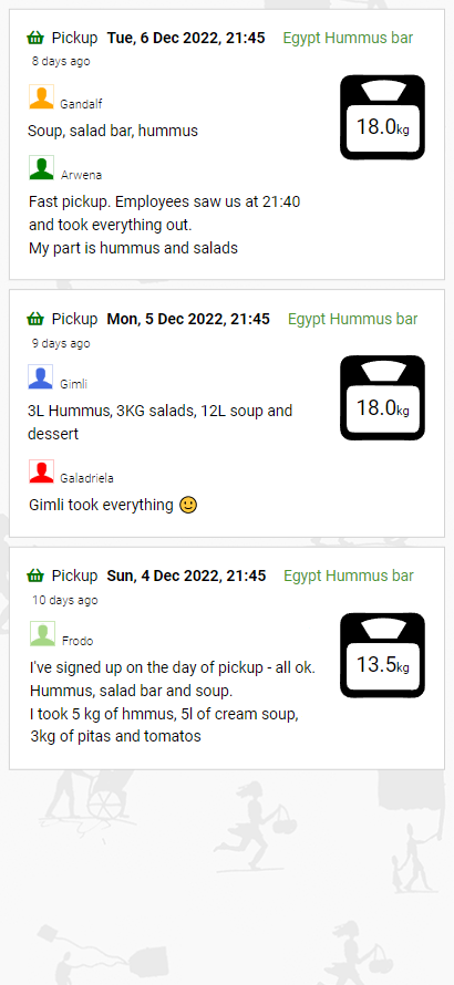
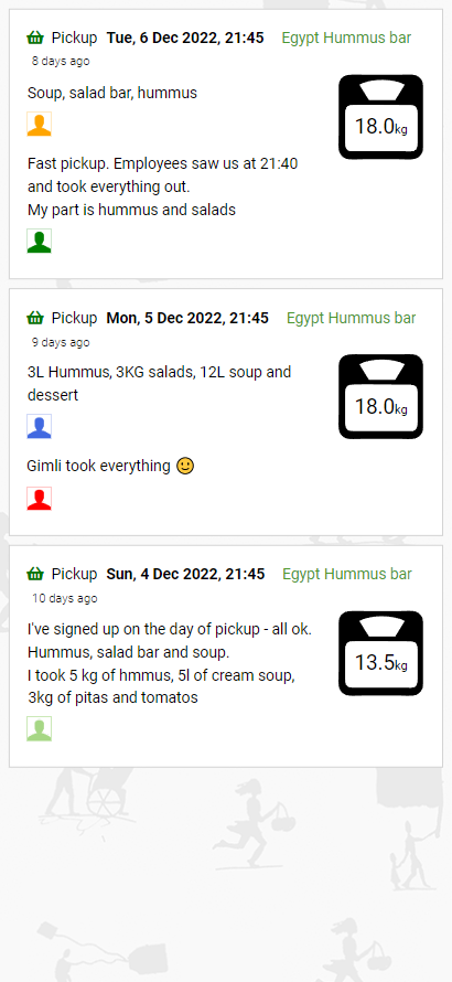
Possibility to display one combined feedback for one activity with 2 or more members (signed up in several slots) - currently these are separate feedbacks. When another group member wants to see if he or she “can do it” or “how many bags/containers should prepare”, separate comments distort the view for one, individual activity.

Objectives:

  • Make easier for group members to estimate how to prepare for pickup at the selected place

Possible acceptance criteria:

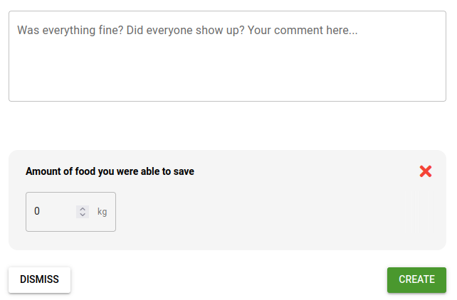
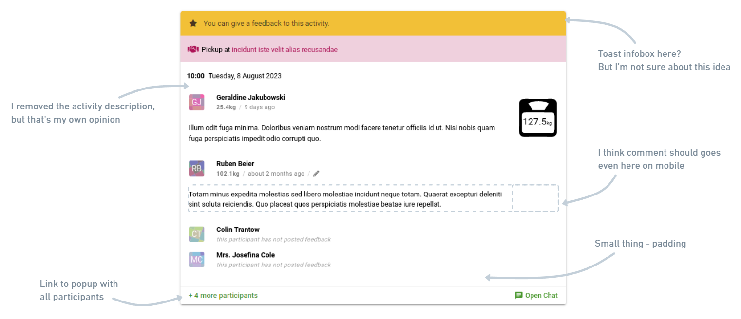
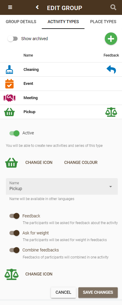
  1. Addition of new setting “Combine feedbacks” to “Activity types” in group settings.
    1. Possibility to set “Combine feedback” only to selected activity types.
    2. Additional notes under switch buttons for “Combine feedbacks” and "Ask for weight”
  2. If the above setting is set to “true”:
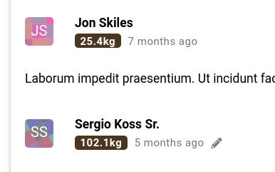
    1. All separate feedbacks with same “activity id” will be combined into one on the front
    2. (If present), filled weight from separate feedbacks with same activity id" will be summed up on the front
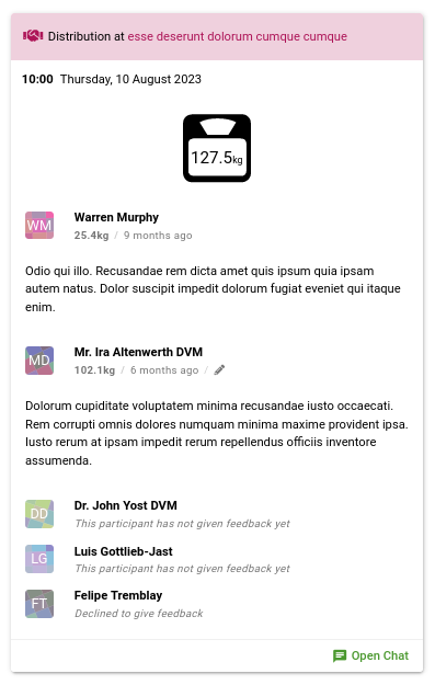
    3. Suggested UI change:
      1. Option 1 - moving the group member’s avatar above the comment and addition the name of group member (suggested)
      2. Option 2 - keeping the current UI
  3. If the above setting is set to “false” (as it’s now), feedbacks will work same as now - displaying separate feedbacks from different group members for one “activity id”.
    1. Possible UI change
      1. Based on the decision made in point 2. 3.

Mockups:
pt. 1 - settings:

current view:

pt. 2. 3. 1. - option 1 (suggested)

pt. 2. 3. 2. - option 2

Potential use:
(in other places that are not the subject of this user story):

  • Probably none

Additional info:
Worth to remember, that that this setting shouldn’t apply to statistics or other places where it can have a negative impact. The change should only affect on front of feedbacks

2 Likes

Hello there! Thank you very much for your thoughtful and well described contribution!

In my opinion this would be a great improvement on the UI for feedback. I think it would make sense in our group too. I’m just a little hesitant about adding it as a new setting, considering the complexity or confusion that it might add (thinking in terms of user experience). I would go for making this a new standard, basically just change the UI.

The thing about the weight is the tricky bit I think, because if I’m not mistaken the current behavior is that for the purpose of place statistics it sums the weigh that different people input for the same activity. I remember a lot of discussion about this in the past (see Statistics about the amount of saved food), and I personally still think it’s not satisfactory because it’s not clear and obvious on the UI how it works

After more thought, I think there’s not reason to add a setting of merging/separating feedbacks.
Initially, I was concerned about feedbacks in events, that they can be quite long in the situation, when a large number of people participate. I checked the comments in my group and it shouldn’t be a problem though.

Unfortunately, I also don’t know how it can be implemented in backend, I was only thinking about combining it in the feedbacks frontend.

Yes, I can imagine it without needing a setting, just make it show in the combined way for everyone.

It will need to handle long feedback comments nicely, as that’s how I use it in a local group here, but I think that’s do-able. Maybe just showing it really long is OK. Just enough to be able to distinguish who wrote what (and maybe when?).

I think it will benefit from doing a proper backend for it, and I started then imagining if it should be combined with a UI for viewing past activities (with or without feedback), as that’s sometime that comes up quite a lot with people.

I don’t know all the use cases for viewing past activities, but for me personally it has been:

  • to access information that was in the activity description
  • to access the chat (which I may not have participated in)

Yes, there’s a point there with the long comments. Maybe using the same “Show more” component that is used in place description and activity description is a good solution.

That is actually requested often. But I guess that after we have a suggested UI for this, it’s up to person implementing it to decide if they want to tackle this altogether or just the frontend changes as suggested by Hubert. Would you consider this specific enough for implementation, from a developer’s perspective, @nicksellen?

We used our new process to decide what to work on next, and this is the topic we picked!

@hwojcik are you around still, and interested in collaborating further on this? it was a really good idea, and nice mockups. we can progress it in any case, I will start on some of the coding for it soon :slight_smile:

@nicksellen
Hey Nick,
Sorry for the late reply. Of course, I’m still interested in this feature as well as the collabartion itself :slight_smile:
I am very happy that this feature has been chosen for development. Many people at FS Warszawa mentioned that sometimes is hard to figure out the comments.
I think the best option would be option 1 - avatars with names above the user comment, and what’s obvious, all comments from one pickup combined into one feedback.
Thank you!

2 Likes

Great!

I started on it…

I did a bit more thinking, and often people have asked for a view of past activities, and this feedback-by-activity feature is actually more like a listing of past activities that have feedback.

So… I went down the path of making it re-use the activity component, but such that it shows the feedback… (and also listed in order of most recent, then getting older).

A few points:

  • I still included the user icons for all the participants at the top, but smaller icons… I was thinking it might be useful to see everyone who was signed up, even if they didn’t give feedback?
  • instead of the Join/Leave button on the bottom left, it’s just a button that doesn’t do anything, but shows which type of activity it is… not sure about this…
  • you can still access the chat, which is something people have asked for before too…

I’m happy for any feedback!

1 Like

Hey Nick

After you wrote “I did a bit more thinking” and about using of similar containers for activity and feedback, I changed my way of thinking a bit. I also turned the rules upside down, so the idea below is more of a collection of ideas and thoughts that could possibly be used.

  1. Thinking of design - “mobile first”
  2. since it’s possible to open a chat before participating in activity, it should also esxist in feedback (which is the finalization of the activity) - it’s a great idea! Chat history from activity can be valuable.
  3. worth to keep the activity type. I used the current solution, but modified it a bit on the front. The type of activity on the mockups you posted suggests a link that doesn’t exist - this can be confusing for users.
  4. on my mock-ups, I forgot to add the time when the comment was added by the user, as well as the pickup weight per user. Great that you remembered that, I added it to my mockups as well.
  5. worth to keep link to place in place name.
  6. I had no idea for a list of users participating in the activity. Initially, I was thinking about the bottom of the left corner, which is now empty, but I don’t like the fact of duplicating avatars. Perhaps an “X participants” link that opens a pop-up with a list of users participating in the activity?
  7. depending on which place in Karrot user checking feedback or activity, different things are important to see. Below my thoughts:
    a. in the list of all activities the most important is the time and place and date a bit (probably usually it’s checked on the current day to fill all the activities that nobody signed on before),
    b. on the activity list of place - date and time,
    c. in the list of all comments - date and place,
    d. on the list of comments of place - date
    I tried to create such containers so that it would be possible to hide the place name and type of activity. The group contaniers in one date (which is on your and my mock-ups of the list of all feedbacks) can also be hidden. The order of the time and date inside the container can be changed from “[time][day,date]” to [day,date][time] depending on where and what it’s more imporant.

Mobile:

Desktop:

On the mockups above, I added a state of waiting for a feedback and a state of opting out of feedback - I know, this is a new feature that has not been mentioned before and it is not valuable for the current feature, but I added it as an additional idea.
As a member of Foodsharing Warszawa, I can say that posting a feedback is a very important element of everyday participation in activities, mostly due to statistics. Keepers of the points later chasing the forgetful ones and manually check whether the recipients have posted a feedback or not - and this can be different.
I can create a new user story and analyze this topic a bit more.

1 Like

Cool to see the mockups and the whole thing taking shape! I really like them and can see how it will improve the experience in our group too. :tada:

One thing I’m concerned about though is the old question of feedback weight being added (see old discussion Statistics about the amount of saved food - #36 by tiltec). Is there any good way of showing the total amount and (if interesting) the amount each participant gave?

This leads me to another consideration… Ideally when giving feedback it should be totally clear that the amount you’re putting in will be added to the amount another participant in the pickup has or will input. This is not the case now as it is. This might be a different work since it’s about the interface when giving feedback, but very much related to how it is displayed.

This is what the mockup is showing? Is that not clear? There are the scales (as it is in the current one) that shows the total weight. And against each user it shows the individual weight also.

I think we could slip in another sentence, here’s how it looks at the moment:

2023-08-07T12:38:06_area

Just another sentence in that “Amount of food you were able to save” would work I think…

Ok, next round!

A few points:

  • I still included the activity description in it, not sure if it’s a good idea or not
  • added the edit icon
  • removed the kind of duplicated “user has not given feeedback” to just include it in the subtitle bit
  • changed the language to refer to “participant” to make it clearer they participated
  • I wonder if there is a way to make the total weight thing clearer? it’s sort of a bit lost floating on the side there, also probably ok…
  • the top section colour is an 80% lightness of the activity type colour, that made me happy to be able to have the generated value :dancer:
  • when it’s you that hasn’t posted feedback yet, might be nice to say you, and to provide a link to where they can do so…

What is not present here is any consideration of participant types, so it should maybe include that in the subtitle if there is more than one participant type, or that participant type is not member. You might not know much about participant types though :slight_smile:

@bruno @nicksellen Initially, it seems to me that everything is clear of what is the weight of the single pickup, and what is the total weight of the activity. Perhaps to the text „Amount of food you were able to save” add less highlighted information below like “If there are few participants in the pickup, the weight of your part will be added to whole pickup”?

@nicksellen it looks great and wonderful!
At first I was concerned that the background color of the activity title would create too much “rainbow” look a like or it’s too much similiar to infobox toast or… too reminiscent to the 2005 Google webdesign. But it really look cool! In addition, it’s great that the current design system has been used - border radius and box shadow do their job.

  • duplication of the text about the lack of a comment - great idea, but I would add “yet” in the end of “[…] not posted a feedback”
  • highlighting single participant pickup weight - before I posted the previous post, I was thinking about the label placed next to the participant name or in the place where participants weight is already on mockups. In the end, I somehow didn’t like this idea and in my own opinion the current visibility is sufficient. (Idea of label below)
    label
  • segmentation of “lack of feedback” (viewer/participant view) - I was thinking about it too but didn’t have a specific idea either. I thought about placing some form of toast infobox with the option to add a comment here, but it didn’t fit with the rest. Perhaps a link will do the trick? Or maybe adding a toast info under or above feedback title?
  • activity description - I checked what exactly we filling there in the Foodsharing Warszawa group and it looks like this (one point in a list is one place, but same description in a few activities):

“Write the pickup time in feedback. According to the rules, you’re going there at your own risk, there is not always information that will be a pickup.”
“We’re waiting for information from the keeper of the place.”
“Can be combined with other groceries on: st. Apple, st. Cherry and st. Banana.”
“Enter the pickup time in your feedback.”
:point_right: Pick up on Cherry st. until 11 pm, no later. See also groceries on st. Banana 14. More details in the description of the place.”
“We’re asking if it’s something for Foodsharing”
“During summer, you can pickup earlier, from 2:00 pm. We receive information about the amount to be taken on the day of pickup. On Saturdays pickup at 7:00 am.”
“New place! We’re learing together. Please write pickup time in feedback.”
“The place is open until 6:00 pm, you can be there a few minutes after. If place will give you already packed things, leave bags for exchange (paper and plastic).”
“A little reminder. Due to the renovation of the building at st. Cherry 2, Mrs. Hannah’s stand have been moved along with others a little further → to the area of ​​the footbridge on st. Banana - pickups will take place there now - probably during the holidays. Holidays - No restrictions on enrollment.”
“Sometimes employees pack themselves, sometimes we are asked to pack ourselves - you must have gloves.”
“Important: You should be there at least 2-3 minutes before closing time! Can be combined with pickup at st. Apple.”
“At 6:15 pm we receive confirming information from the keeper of the place… (telephone contact).”
“If there will be a pickup, let the know to other volunteer. Be sure to write in the feedback how much was supposed to be picked up and how much did you actually took?”

In addition, the same activity description is almost always present in all activities in a selected location, which would result with lots of duplicates. Sometimes, one or two activities in the selected place have different descriptions, but it’s related to exceptional situations, e.g. a one-time change of the pickup time or the need to deliver pickup to a other place place (e.g. for a promotional event). At Foodsharing Warszawa, this information is valuable before pickup and just before posting a comment, but it’s not important for someone whoes viewing the comments. Of course, I speak here only on behalf of Foodsharing Warszawa - other groups should be asked about how they use this input to analyze it better.

All the rest of the stuff you posted Nick looks great and wonderful! I love it! :heart:

Other action-points:

  • I know that the posted mockup is a desktop view, but it seems to me that the feedback in the single comment on mobile should cover the entire width of the feedback (except the width in which the total weight of the reception is located - if its exist). The use of columns on mobile would significantly extend the height of the feedback container.
  • I added a link to popup of all the participants of the activity. If I remember correctly, in the settings of activity type, you can select whether feedback is required. If not, I believe that the information “This participant has not posted feedback yet” should be hidden. The link could show all users who didn’t add a comment (because it is not required in selected activity type), but participated in the event. I don’t know if I explained this idea in a clean way - if necessary I can describe it better.
  • Small thing - I added padding above the lowe divider

For some activities the feedback is quite optional, and having “yet” to me implies that you should give feedback, or that it might be coming… I am mixed about it.

I tried it out using a QBadge component from quasar:

2023-08-09T10:10:17_area

Personally, I think I prefer it without the badge, as it makes it a bit heavy (I did try out the outline versions too…).

I’ve got with the idea to have a bar above it… which also shows my idea for mobile/small screens, putting the “AmountBox” at the top in the center…

Also shows “You have not given feedback” when it’s you.

I’ve removed the activity description now, we don’t have it currently, so I think best leave it out… maybe in the future there can be a link to view the original activity, including description, as I can imagine sometimes it’s useful… but let’s leave it out for now.

Here’s the view now of a list of them:

I noticed that when there is only 1 comment, it is quite inefficient use of space, having the additional top bar, and the bottom bar just for the chat link… I think it’s OK, but I just noticed it. I wonder if the date line could be included in the top bar?

And here’s the mobile view again, but also showing a dismissed feedback:

So it’s nearly ready!

There is also the view when you’re giving feedback, and it shows you previous feedback for that place, but I can just drop in the same view…

I also added some padding at the bottom now, although not as much as in your one :slight_smile:

Sorry for the long replay time, but I had lots of work last time.

@nicksellen
For some activities the feedback is quite optional, and having “yet” to me implies that you should give feedback, or that it might be coming… I am mixed about it.
I agree. I thought, that:

  • For activities, where giving feedback is mandatory, add „yet”:
    • The information “This participant has not given feedback yet” is always shown if the participant has not added a comment yet
    • “Declined to give feedback” - (here I don’t remember whether the participant can reject, if feedback is obligatory). If he can, we also show it here (but I don’t know why they could reject it if the comment is obligatory)
  • For activities where the feedback is not obligatory - without all the information “This participant has not given feedback yet”.
    • If the participant doesn’t post or rejects a feedback, there is no need to show him in activity contanier, both “This participant has not given feedback yet” and “Declined to give feedback”
    • Instead of this, we can show “+ [n] more participants” showing participants who didn’t post or rejected feedback (because it’s optional, so we don’t need to show information about not adding a feedback)

But probably such a division would be an additional development. In my opinion (which is combined with some needs of Foodsharing Warszawa), information about not adding reviews would be valuable only for activities that require it. This is also for “catching” user who have not added a feedback to pickups yes.

@nicksellen
Personally, I think I prefer it without the badge, as it makes it a bit heavy (I did try out the outline versions too…).

I have the same opinion. It looks much better without labels

@nicksellen
I’ve got with the idea to have a bar above it…
Also shows “You have not given feedback” when it’s you.

I think it looks great. On the one hand, it looks a little heavy, but on the other hand in most cases it will be just one or two toast infobars for the entire page (depending on how many activities the participant took part in). And It’s compatible with design system.

@nicksellen
… which also shows my idea for mobile/small screens, putting the “AmountBox” at the top in the center…

Personally, but that’s just my opinion. The comment is as important as the weight*, so I didn’t put the weight “above” the comment. For very small devices it might be a better way, but it seems to me (in my own opinion) that the best way would be as it’s now. Maybe there’s a way to reduce the size of total weight container a bit? If I remember correctly I reduced its size on one of my mockups to around 70-80% of current ones. But I could also be wrong, maybe it will actually look better. It’s hard to say to me.
*Regarding what is more important - weight gives a lot of information and counts in statistics, but depending on what type of food is received and in what quantities, the participant prepares to it in a completely different way. Sometimes the pickup rules changing during the pickups and the description of the place is not so often updated.

@nicksellen
I wonder if the date line could be included in the top bar?

Being honest I prefer how it looks on current mockups.

I know that some of my comments may sound “strong” and I fully realize that I’m just giving an idea, but I also giving my opinion. Nevertheless, I think that any form of this developmpent (combined comments) will be great. Thank you Nick!

1 Like

No worries, we work when we can :slight_smile: Last week I was away in Luxembourg with lots of other foodsaving people → BARCAMP & FESTIVAL - foodsharing Akademie :partying_face:

Yes, we don’t have the division right now. I decided to go with the yet variant. That could be a future feature require to have required feedback (which I think would mean you cannot dismiss it right?).

Your input has been very welcome, I didn’t think it too strong at all :slight_smile:

I merged the backend just now, which means the branch deployment for the frontend can work https://change-consolidated-feedback.dev.karrot.world

(you can login is foo@foo.com / foofoo, or create your own account)

I think it looks really nice!

Anything to add before merging? (aiming for a good enough for now level, and tweaks can still be made! - if you want to learn enough development to make some tweaks yourself, would be happy to help you there)

I merged the frontend! Doesn’t mean we can’t make further improvements/tweaks, but will be good to see it in action. I’ll probably do a production deployment later this week, one evening.

It’s live on https://karrot.world now! :partying_face:

1 Like

That’s so much better! Thanks to everyone involved :star_struck:

1 Like

Hey @nicksellen
I know, that I don’t need to write, but sorry for my long absence.

Development looks great! On behalf of Foodsharing Warszawa, thank you very much!
It’s been a while since merge into the production environment, so I’ll try to collect opinions from the group. Probably everyone already has the opportunity to test it :slight_smile:

1 Like