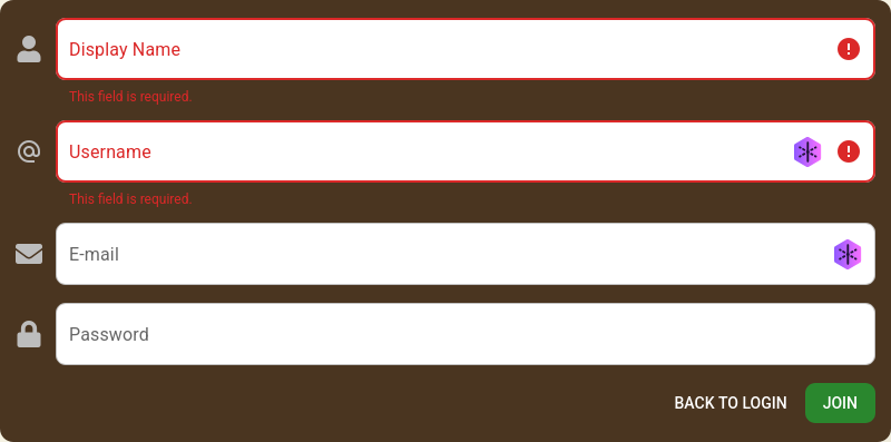
User story:
Bad color combination for color-blind people on sign-up page when warnings for fields are displayed (red on brown background)
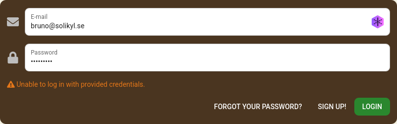
Maybe also for the login page? (colors are better there though)
Complexity: easy
Outcomes (or what needs to be done to move forward): find a new color for the warnings