Hey everyone!
In the last weeks, I worked on two new features for Karrot: store walls and subscriptions. They are currently available for testing on https://dev.karrot.world and we plan to release them to karrot.world next week.
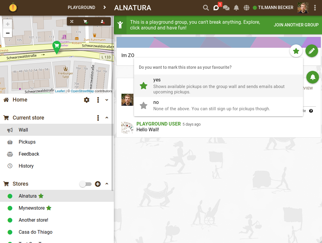
You can use the store wall to discuss topics per store (instead of writing on the group wall). Vice versa, with store subscriptions every group member can decide which store they want to mark as their favorite, thereby subscribing to notifications from this store.
Pickup notifications on the group wall will only show pickups from favorite stores. This reduces the cognitive overload when your group has many stores and you are only interested in some of them.
Also, you will only receive upcoming pickup email for stores you marked as favorite.
When the new features goes online, you will by default be subscribed to the stores you picked up from in the last 3 weeks.
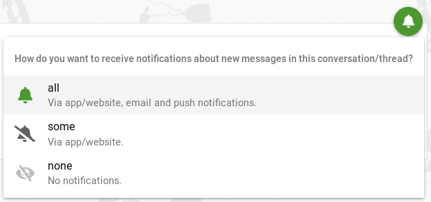
To make all this possible, I had to make significant changes to conversation notification settings. It’s now possible to unsubscribe from any conversation (except private ones and thread replies). I replaced the simple notification toggle with a more sophisticated one:
New notification toggle
Ok! - If you are curious how this works, you can already try it out on https://dev.karrot.world right now.
Any comments on it? - I’m happy about feedback here or on the Github issue.
I tested a bit and have just one (big) comment. Could the pickups and the wall be on the same page? I think pickups are more important actually and now the wall is the first thing one sees. Maybe these could be next to each other always of maybe the wall could be opened or closed from the side or something. I would prioritize the pickups as the default page.
Hi. It’s my first post here I’ve played a bit with new features and have the following comments / suggestions.
1. Pickups page should be a default one when a user clicks on a store
Pickups are more important than a Wall, especially when it comes to specific stores. When a user clicks on a store at the panel on the left, in most cases he/she expects to see available pickups for a selected store. This is also what everyone is currently used to. In the new set-up users will only see a wall with description of the store and some discussions. It requires extra click to get to the Pickups which is unnecessary effort and may introduce confusion. Althouth the feature to have discussions on specific stores might be handy, I suppose it won’t be used on regular basis because, in most cases, there is nothing to discuss. Therefore, I would strongly recommend to keep Pickups page as a default one when a user clicks on a store.
2. Do not separate buttons between Wall and Pickups pages. Keep all buttons available on both pages
A button to subscribe a store is only available on Wall page. Is there any reason not to have it also on Pickups page? The same applies for Edit button. The upper sections on both pages look exactly the same - they contain a description of the store but available features are different. Although I might understand the logic behind this, I personally think this introduces unnecessary complexity. My strong preference would be to have all the buttons: Subscribe, Edit, Show and Manage the Pickups, Get Directions both on Wall and Pickups page.
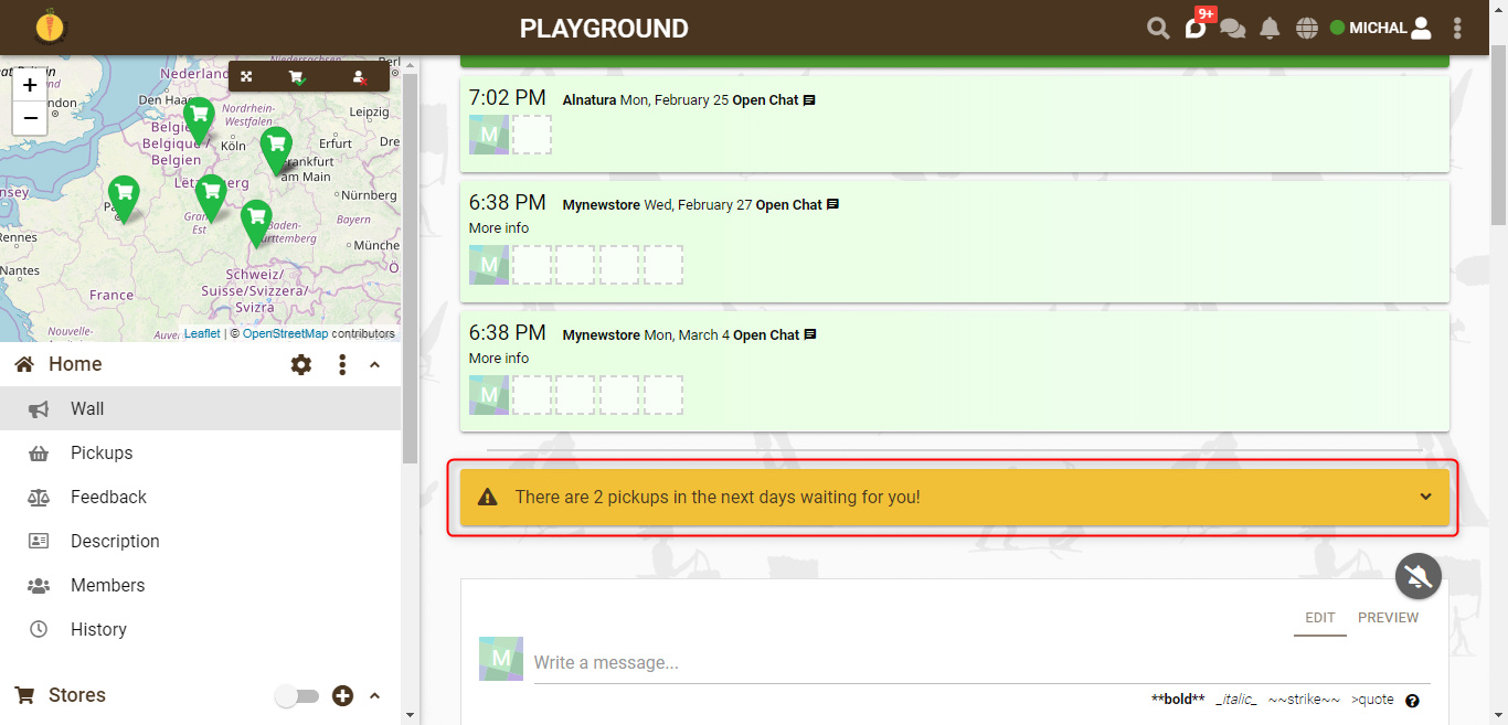
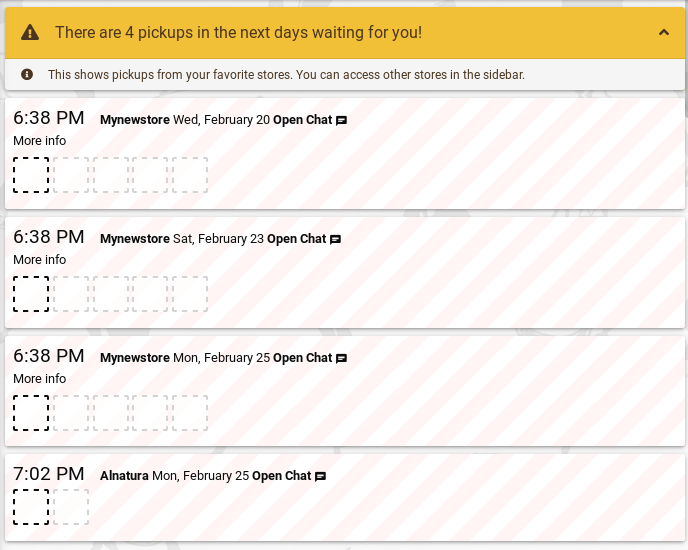
3. Text on the main wall regarding upcoming pickups could indicate that it’s only about favourite stores
Currently it says “There are 2 pickups in the next days waiting for you!”. But it could say “There are 2 pickups in your favourite stores in the next days waiting for you!”
Thanks! I’ve had a few tests and everything seems fine. I’m very happy you took my comments into consideration While playing with Karrot on DEV today, I realised one more thing which brings us to my next proposal:
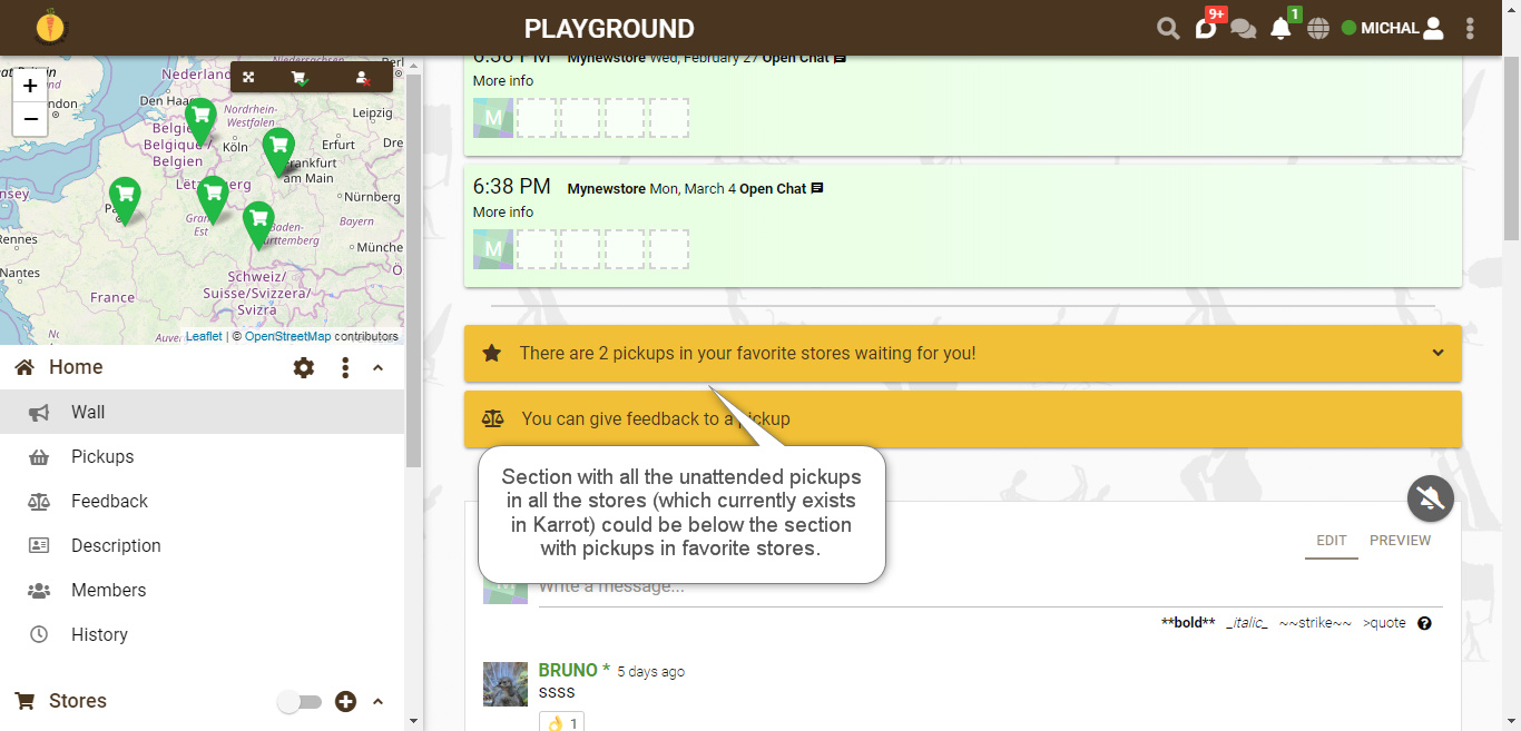
Keep section which shows all the unattended pickups in all the stores below the section with pickups in favourite stores
After you added a new section with pickups in favourite stores, we don’t have a section with unattended pickups in all the stores any more. This section is very helpful to track which stores still need to be attended. It also might be an incentive to join an unattended pickup in a store which is not among the favourite ones. Moreover, in Poland we have a dedicated person each week who is responsible for overseeing that all the pickups in Karrot are attended. The section which shows all the unattended pickups is the best tool to check what is missing. It saves a lot of scrolling on Pickups page and helps avoid situations that some unattended pickups will be missed (especially if there are a lot of stores). To sum up, my recommendation is to keep the currently existing section which shows all the unattended pickups in all the stores below the section with pickups in favourite stores. Hopefully, it shouldn’t be difficult to add it since we have already had this section so far?
About your new proposal: the current list in Karrot shows all pickups in the next days that are not full (and the current user is not a member). It seems to me that you actually need a list that shows all empty pickups in the next 7 days. Is that correct?
What do you think about adding a filter option to the group pickup list?
Hi. By unattended pickups I meant a list of pickups which are not full. I forgot that current list would not show the pickups where the current user is already a member. Actually I’m not sure which option is better though. They have different purpose. All pickups which are not full help quickly identify find pickups where we need or might need help. All pickups which are not full excluding the ones where I’m already a member show pickups which I still can join. A bit different purpose and I don’t have a strong opinion which is better.
I like the option to filter the pickups. This gives a user an extra feature and doesn’t overload the screen with too many information. Where would this Filter button be? On the Pickups page? I think this could do what I tried to request. If we had a Filter button on Pickups page which would allow a user to show only pickups that are not full, this would give users a possibility to easily oversee if all pickups are attended. Therefore, I’d propose to have the following options in the filter:
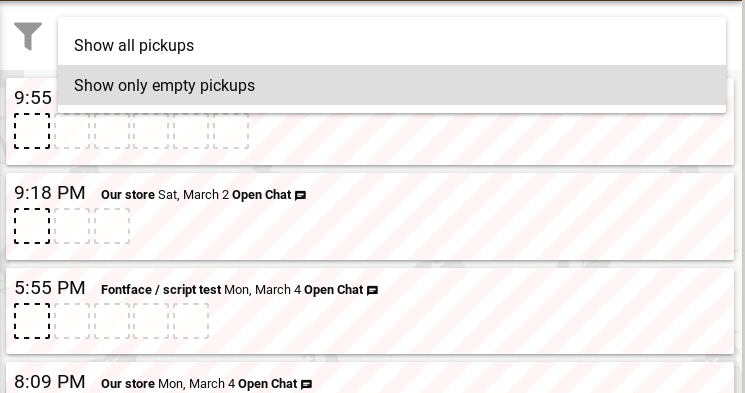
Show all pickups
Show only pickups which are not full
[Optional] Show only empty pickups (this would exclude stores which have at least one member)
Thanks for the clarification! I published the pickup filter to dev.karrot.world, with the third option added (“show not full pickups”) and the descriptions shortened.
Hi. I tested the filter. The functionality works fine and it is a very helpful feature. Thanks! If I were to be picky, I’d only recommend to make it stand out from the background a bit more, i.e. change a colour to grey or add some shaded borders to make it more visible.
I’ve been making some quick observation about how the wall on stores is used and gave some thought about it:
People are still using the main wall for posting stuff that are definitely more suited to the store wall, either because they do not know about this new feature or because they believe it’s more hidden and others won’t read their message.
It’s takes a couple of steps to check if there are any messages on a store wall if you haven’t subscribed to it. You need to first click on the store, then on wall, and you will not know if there is anything new there until you reached the page.
Ideas for improvement
Make it visible who has subscribed to a store, so that it will be more likely for teams or communities to form around that specific store or place, and it will give some assurance of whom will be reached by your message when you write on a store wall.
Show on sidenav next to store name the number of new messages. Like a mini-notification. Problem is that this might be confused with a notification for new/available pickups
Add a chat icon together with others on store page (too much maybe?) or any other kind of element between the description of the store and the pickups that give access to the wall and visibility of new messages. The eyes are first drawn to that page rather than sidenav where you find the link to the store wall, don’t you agree?
I definitely agree with Bruno! I think that people look for the wall somewhere on top, not left. It could be more visible and also new messages could be visible. And also who is there - so all that Bruno mentioned :-).
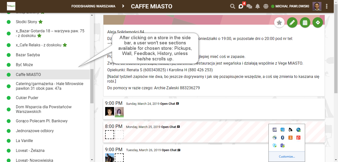
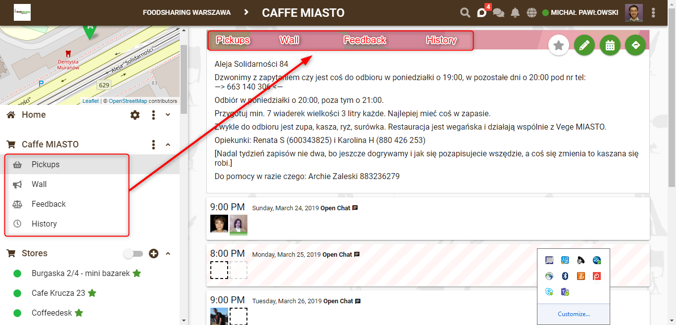
I agree it might be a bit unintuitive to even find a store Wall, unless you know where to look for it. When a user clicks on a store in the side bar, main store page with pickups will open (and this is OK as pickups for the store should be a default page), however, side bar won’t display sub-pages available for the chosen store, i.e. Pickups, Wall, Feedback, History, unless a user scrolls up:
It could be much easier if all the sub-pages were also displayed at the top as this is probably how a user naturally searches for any type of navigation:
If such top panel were available at each sub-page for each store, navigation would be much easier.
As far as this comment is concerned:
I would suggest asking users for a reason. It’s still a new feature, therefore, they might not know / remember how to use it correctly. Moreover, in each case it’s worth reminding them that store-related discussions should be moved to store walls.
Another input I got from a Bike Kitchen user is to make it easier to subscribe to a store/place by having the star directly next to the store/place name on the sidenav.
Isn’t that already the case? It works when the user is subscribed to the conversation (“all” or “some” option) - if they are unsubscribed, we should respect their wish to not get informed about new messages.
I got a feedback again from our foodsaving group yesterday that it’s hard to find the store wall. I got it from a friend who is responsible for one cooperating store and could not explain to an older man using Karrot where to find it. The good news is that people are actually trying out the store wall and see its usefulness. But they adopt it after someone shows them that the feature is there. My friend started by writing a message there and asking if the people who subscribed saw the message and he actually many replies, which also shows that notifications are doing their job!
I’m really happy you started working on this. It can make Karrot even more user-friendly. I have two comments to the navigation tab:
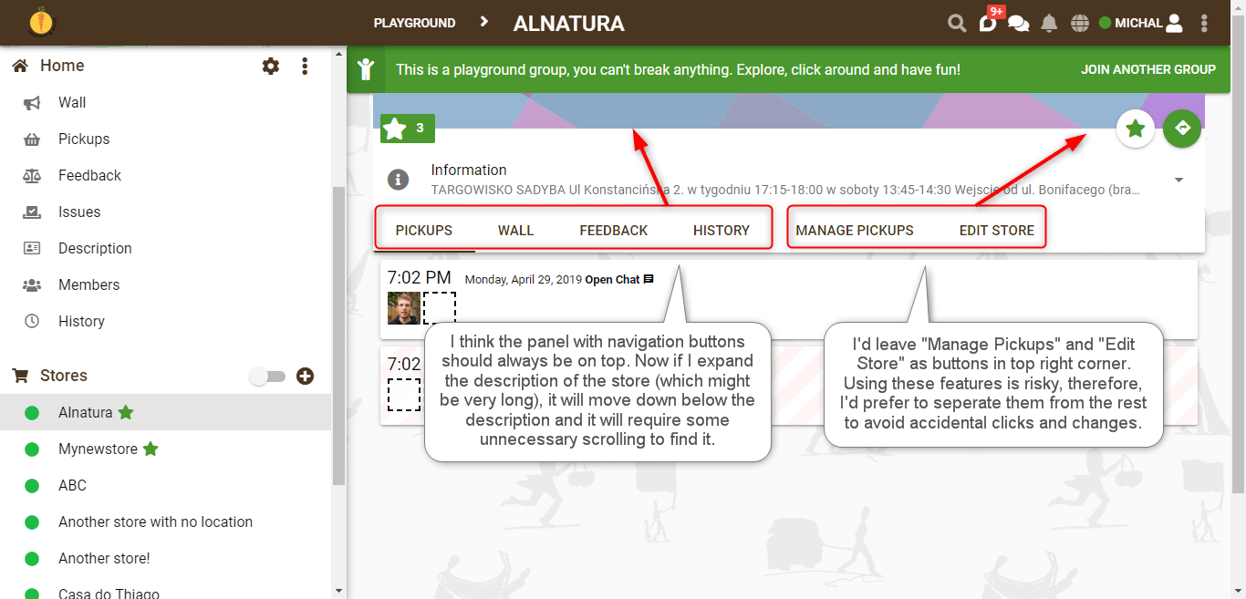
Move navigation tab to the top, above the store description. Currently navigation buttons are below the store description which is collapsed as a default. In such a case it looks nice. However, store description is important and it normally should be expanded because it conveys a lot of critical infomation for the pickup. When description gets expaneded, navigation buttons are moved down and if description is very long (which often happens in our stores in Warsaw - see example), it will be a bit cumbersome to scroll down and find them. That’s why I think they should always be at the top, above the description of the store.
Keep “Manage Pickups” and “Edit Store” as buttons in top right corner. These two options can be used to modify the store and pickups. I’m afraid that the fact they are now at the same place as all the other tabs (“Pickups”, “Wall”, “Feedback” and “History”) suggests they all have equal importance and it even encourages users to click them to see what they contain. This may lead to unwanted situations when someone will accidentally make some changes in the pickups or store settings. These two options were not available in the navigation panel on the left and I’d keep the same logic here, i.e. not show them with the rest but leave them as they were in top right corner.


 I’ve played a bit with new features and have the following comments / suggestions.