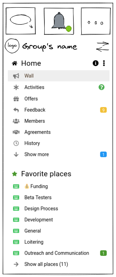
User story: I find it very difficult to tap the message and notification buttons on mobile sidenav/hamburguer menu. I’m pretty sure I’m not alone. Here’s a little sketch on how to improve this:
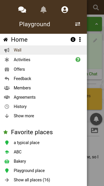
One additional point about the menu that’s confusing me is that I can move it in any direction. I’d expect it to be more fixed e.g. not allow it to scroll down when sliding back to the left. What do others think?